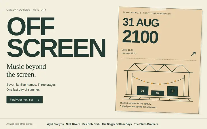
OFFSCREEN 2100
A one-day festival for musicians from films and series. A ticket-poster hero, a timetable across three stages with a stage filter, set notes that open in place.
An experimental CSS framework
Most layouts stretch, squeeze and rearrange themselves until the design is somewhere else. Prastora scales the whole page instead, like a picture, so what you composed is what people see, from a phone to a television.
No build step, no runtime, one sloth.
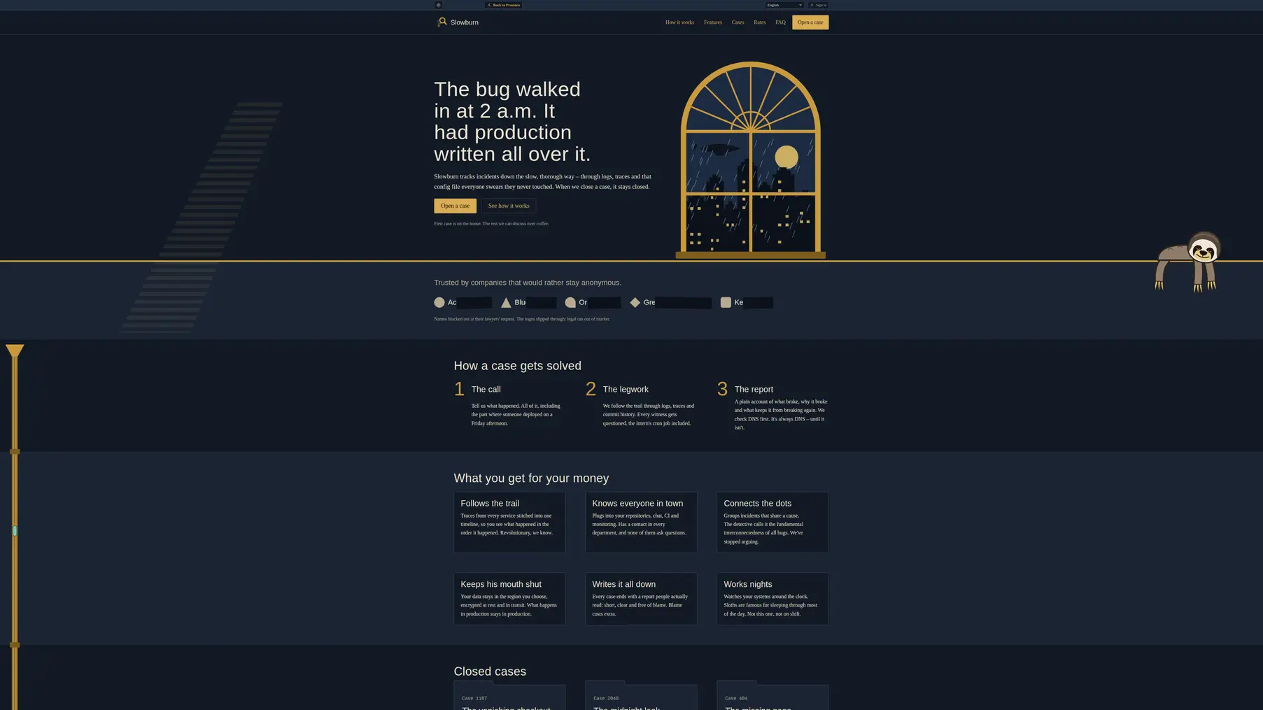
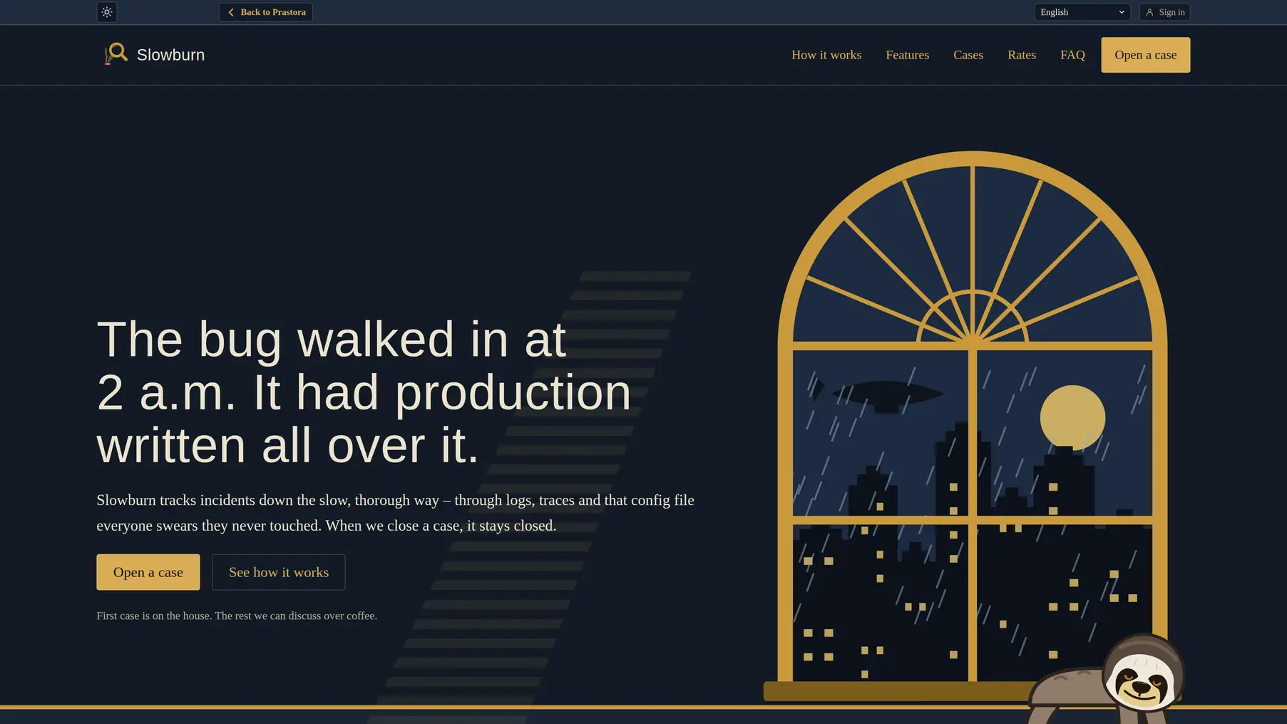
Most templates come as small fictional sites with their own theme, navigation and sense of humour, and more keep arriving. Here are three of them, one a single-page festival; the rest, including Slowburn from the comparison above, are in the catalogue. Same framework underneath.
A one-day festival for musicians from films and series. A ticket-poster hero, a timetable across three stages with a stage filter, set notes that open in place.
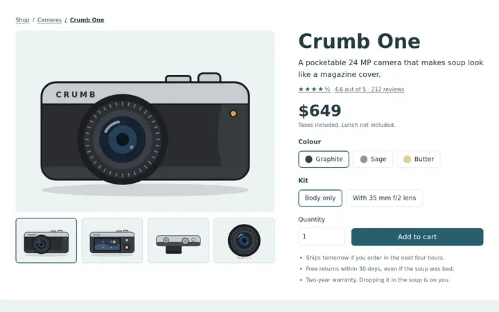
A camera shop for people who photograph their lunch. A product page that recolours the camera, a calm checkout and a dense back office.
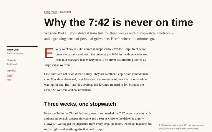
A city magazine in newsprint. A long read with sidenotes, a photo essay with a lightbox and a subscription coupon you could actually cut out.
Link the CSS files and start. Nothing to install, compile or update next spring.
Core, theme, components and page styles sit in cascade layers, so they stop overriding each other by accident.
Galleries, filters, price switches and form checks run on HTML and CSS. Pages still work when scripts don’t load.
A short script keeps the rules, and screenshot comparisons catch the changes you didn’t mean to make.
This is a framework in development, not a finished promise. Explore the examples and consider what could work better. Feedback, use cases and suggestions are welcome.